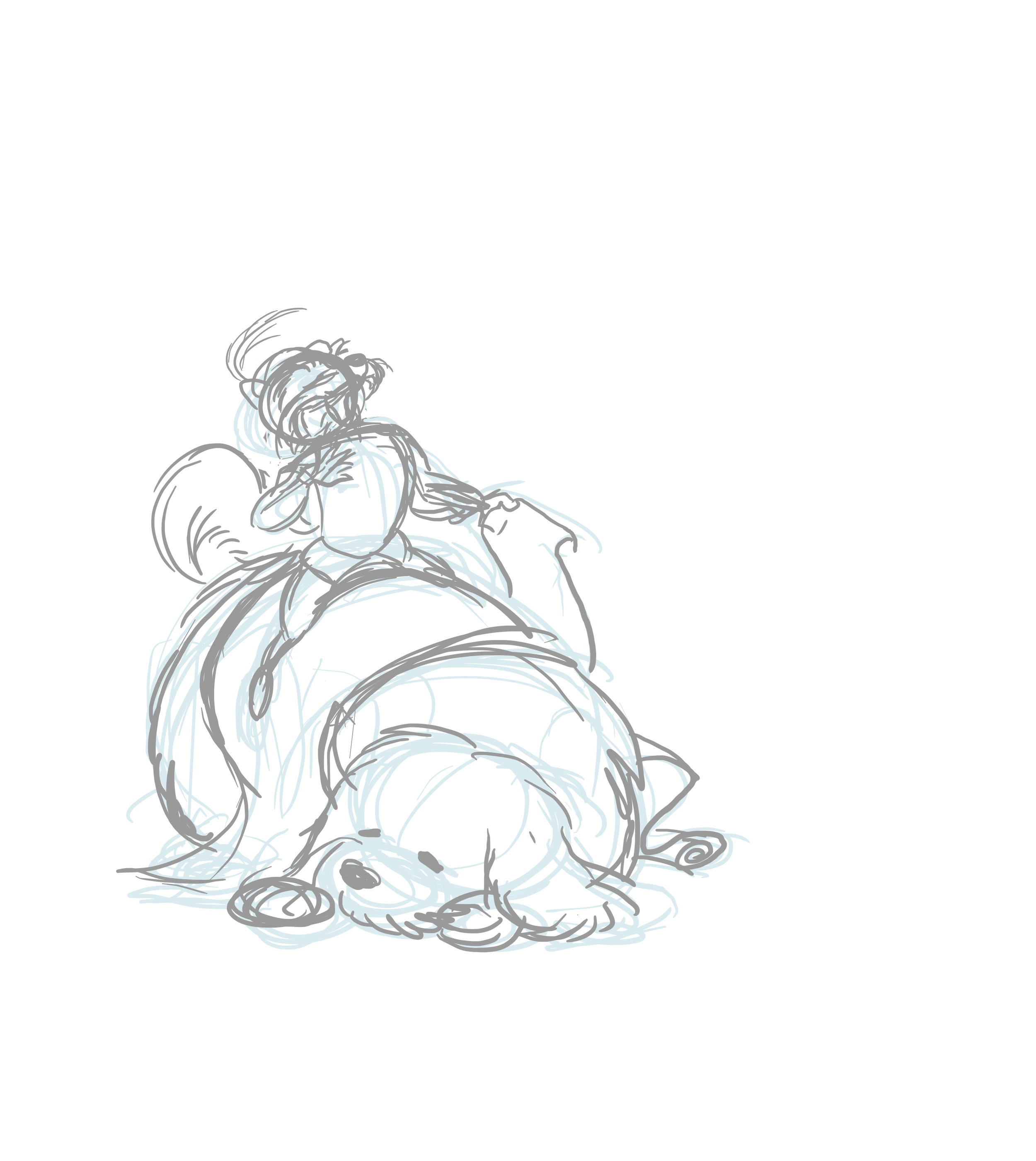
Cartoon Sara Draws Stuff - Smalerie's Birthday Card 2015
I haven't done an art process post since the Usagi Yojimbo one almost two years ago. My output remains sporadic, but I did just undertake a project where I'm pretty pleased with the results. So it's time for round two.
Tools
Not much has changed since the Usagi pic. I still work almost exclusively digitally on my Cintiq monitor, and I still use Pixelmator. My Mac Mini remains fairly functional and my desk is still a mess.
Subject
I sometimes draw digital birthday cards for people I like, including the other Ladies. I had an idea for a Labyrinth themed one for Smalerie kicking around for a while. So when February rolled around and her birthday was approaching, it was time to get to work.
Process
Reference
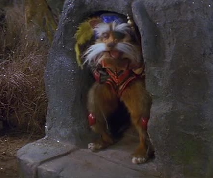
I have never drawn any of the characters from Labyrinth before, so reference was essential. I quickly discovered that the internet does not have sufficient Sir Didymus and Ambrosius reference. Most of the image from the film I found were on the small side, fanart is of questionable accuracy, and - as Smalerie pointed out when we visited the Center for Puppetry Arts - the remaining puppets are not all in the best condition. So I had to dig out my DVD and get some screencaps of my own to sort out what Didymus's hat looks like or how his knee guards are attached to his legs. (They really aren't.)
Rough Sketches
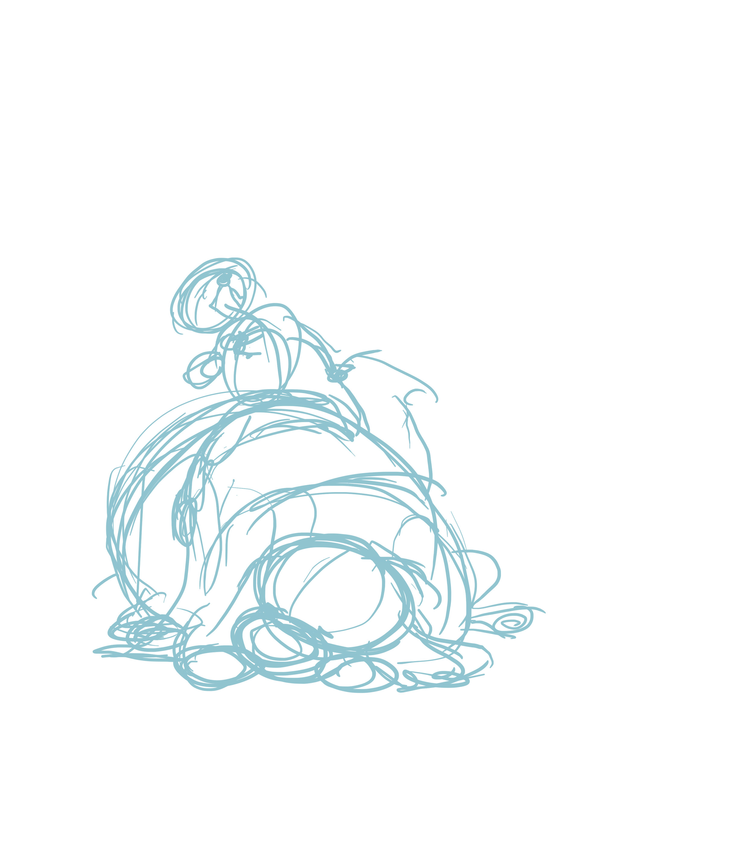
A really rough first sketch, trying to get a sense of the poses I wanted. Highly enthusiastic Didymus and a very sleepy Ambrosius. Seems to be working okay so far....
Nope. Ambrosius looks fine, but Didymus isn't working. Refining the sketch, I'm realizing it's going to be tough to make his expression to read under his "mustache" from this angle. And it's just not working for me. I actually didn't do anything with the drawing for about a week. Coming back at it fresh helped, but I probably could have tackled it again sooner.
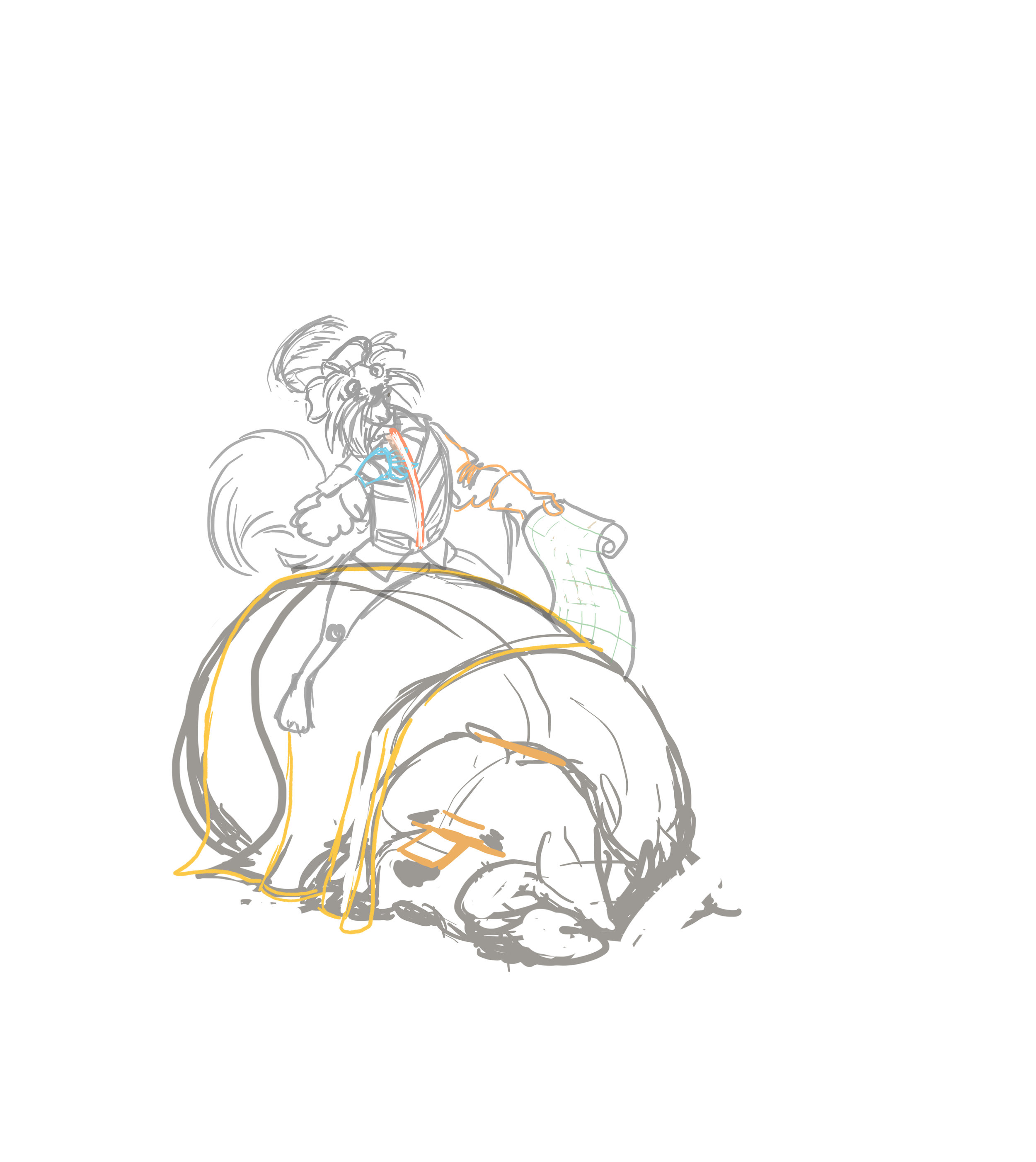
Having the head more straight on was actually what I'd originally thought of doing, but I thought the tipped back profile would be more interesting. Turns out my first instinct was the right one. The colored lines are refinements of details I hadn't fully worked out and needed to go back to later, like the structure of Ambrosius' snout and Didymus' hands.
Brace yourselves; this next one is a little disturbing.
Didymus - Colors and Lines
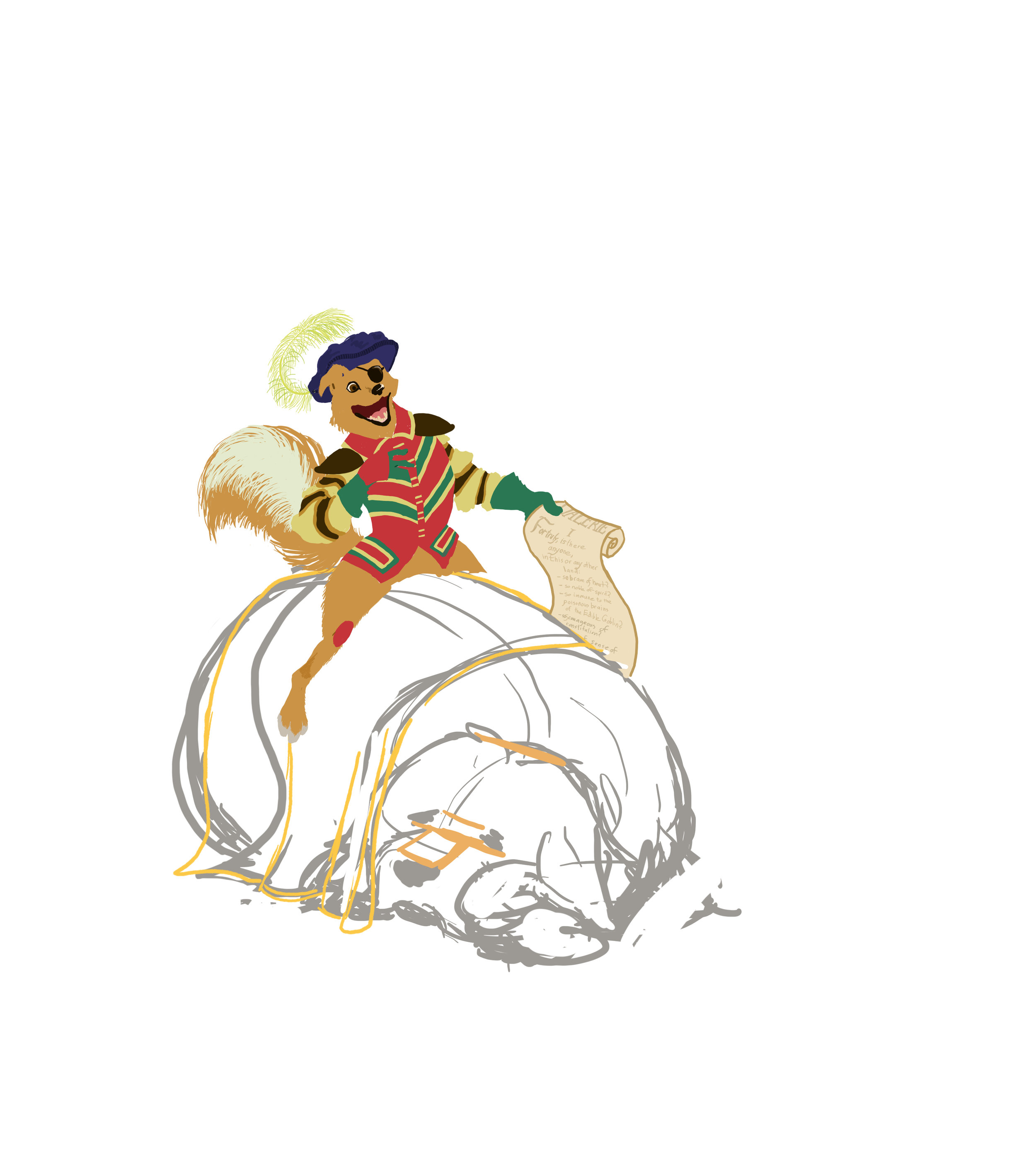
I put all of Didymus' whiskers and eyebrows on a separate layer to make corrections and shading easier. He didn't look like this very often. His tongue is also on a sport layer behind his teeth for the same reasons.
I decided that I wanted very little linework in the drawing, so I mostly just colored from the sketch and added a few lines for the facial details. The writing on the scroll didn't actually get added until near the end, when I finalized the text.
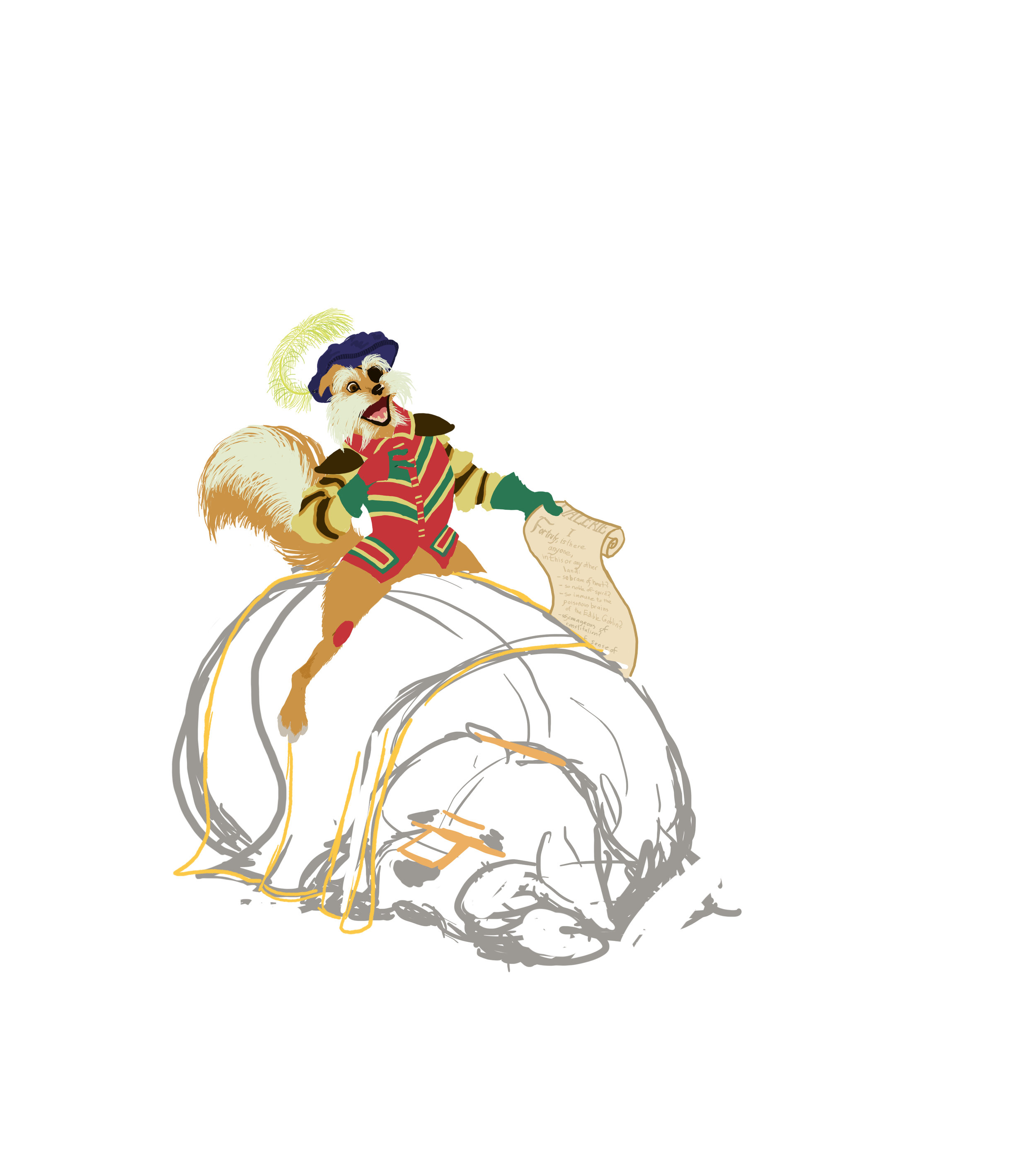
Much better like this, don't you think? And it made everything a lot easier. If I decided I didn't like how the whiskers were looking, I could just dump the whole layer and start over without losing all the work I had done on the face. This is one of the reasons I do everything digitally.
Shading

The first round of shading on Didymus, plus a little transitional fur to soften the line between the darker and lighter area of the fur. The top of his left leg is hidden behind something on another layer that I'd probably drawn by this point, hence the lack of shading.

Didymus' jacket and tail both needed shading, but they both have a bunch of colors close together that made that tough. Plus I was having trouble figuring out a color palette that worked as shadows. So I made a semi-transparent layer and tested out of few different colors and opacities. It came out reasonably well and saved a lot of time.
Sir Didymus is pretty much done at this point, so on to Ambrosius!
Ambrosius - Additional Sketching

I've drawn plenty of dogs before, including Old English Sheepdogs, but Ambrosius was still tough at times. I did some additional sketching to further work out the structure of his head and front legs.
Colors and Lines
Same as Didymus, very little lifework with most of the definition coming from the shading. You can see some errant shading on the ear and a few corrections that ended up on the wrong layer. (There are dozens of them, so sometimes I mess up.) Some of the coloring is very rough because it's getting covered up in the next step.

Remember how I said I didn't want to use fanart as reference? Well, I did end using this piece. The designs on Ambrosius's blanket are nearly impossible to see in the film and this looked accurate to what I could make out, so I used it as a guide. I did check the film reference for the color and design of the saddle. There's a front part to the saddle that's on a different layer because it needs to go in front of Sir DIdymus.
Shading

I got well into this first attempt at shading Ambrosius before deciding that it just wasn't working. Finding a color that read as a shadow on white was tricky and I wasn't getting the dimensional look I wanted.
The shading on the blanket is another transparency layer, as there was no way I was going to individually shade every color on a pattern that complex.
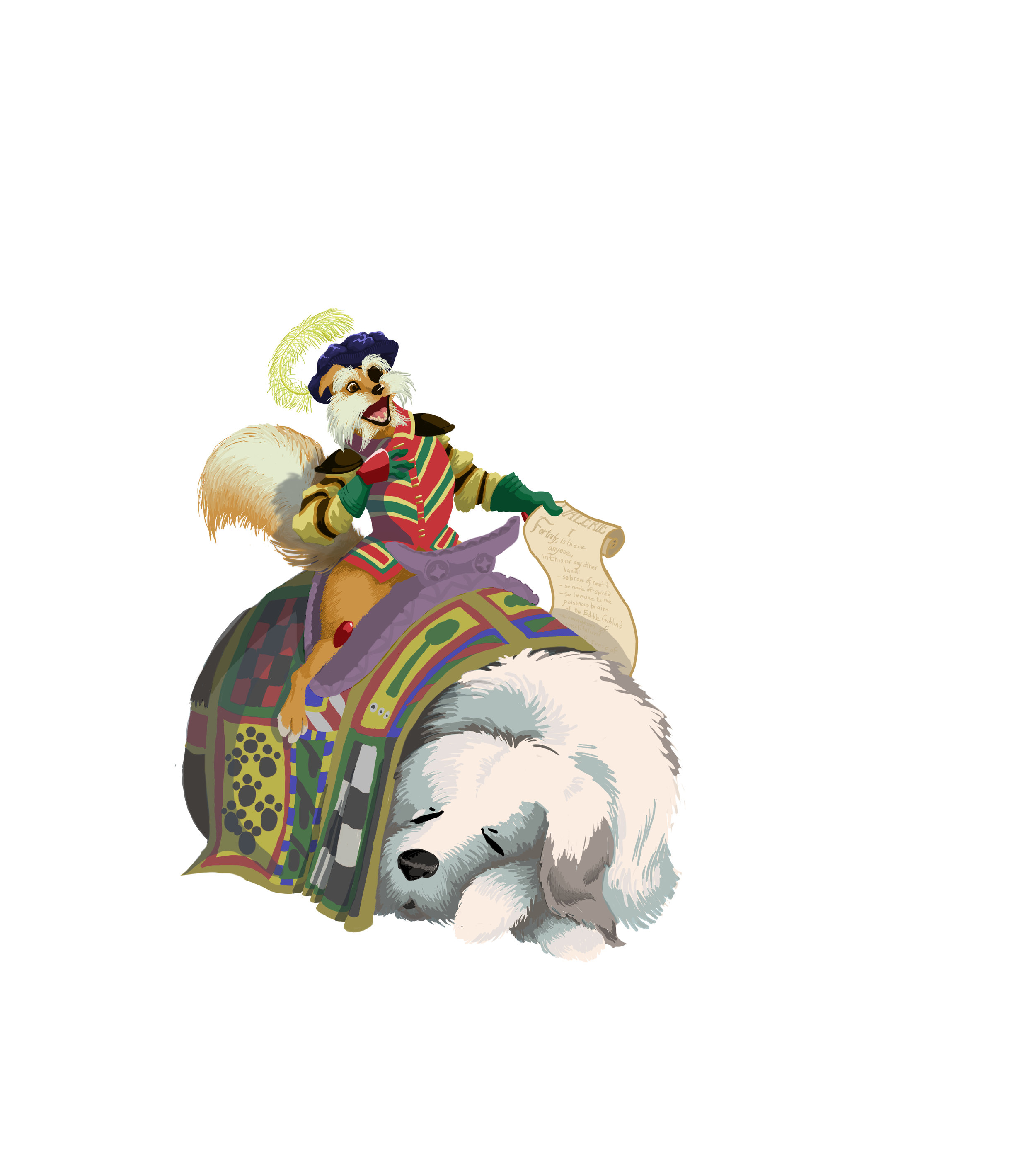
I ended up going with large areas of this more bluish tone instead. I'm still not completely certain I got the right balance of form and furriness, but it's definitely and improvement over the first version.
Background
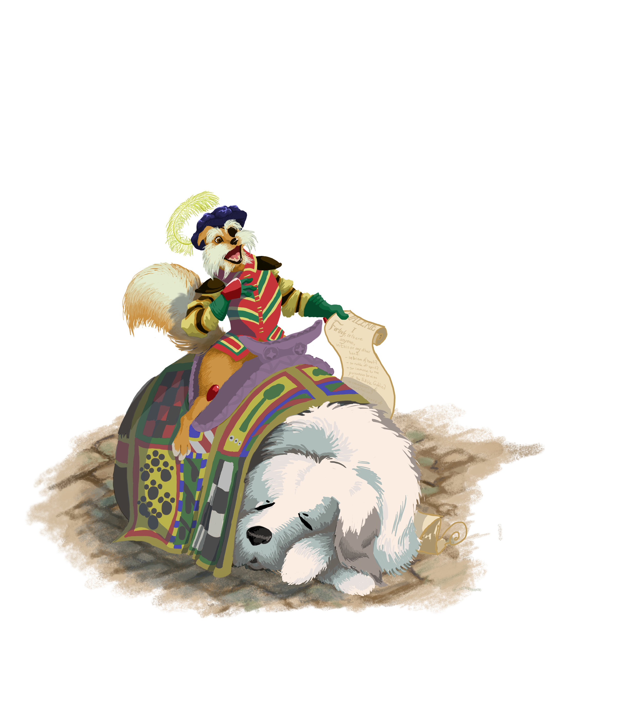
I've been playing around with different brush styles more lately. Pixelmator can use Photoshop brushes, which saves me having to track down brushes designed specifically for the program. I haven't found a ton that I love yet, but some of the chalk-like brushes were just what I needed for the rough texture on the cobblestones for the ground. It's just enough to suggest the environment of the movie without being too much of a distraction. The shadow in the front is yet another transparent layer.
You can also see the bottom part of the scroll here, on its own layer so it can go behind Ambrosius. It's about to get covered up even more, so it's only about half colored.
Finally - the Text!

Finally, something easy! The idea for the poem and a tired and bored Ambrosius interrupting it with increasingly loud snores came to me on a walk into Lexington Center, as did the idea to use varying fonts to show the effects of the interruption. I freehanded the Zs to make them suitably messy. I wanted the word balloons to look like they belonged with the artwork, so I used the ellipse tool to make some ovals as a guide and drew over that. The Edible Goblin is a reference to one of the goblins in the book Goblins of the Labyrinth. As its name suggests, it is edible, but much of it is also poisonous. One portion of its brain is described as "deadly poisonous, unless your name is Valerie."
So that's what I did with most of February.
Got some artwork or other handmade gifts of your own to share? Get ye to the comments!

