
Cartoon Sara Draws Stuff - Usagi Yojimbo
I draw semi-professionally, which means I make prints sometimes and people buy them sometimes. So for today's post, I'll be talking a little about my process on a piece I did about a month ago. What I'll be describing here is the method that works for me, which may not be the best method for everyone else of the best one out there. If you're looking for advice on making your own digital art, I suggest you peruse the many tutorials available on the web and find one that suits you.
Tools
I switched over to drawing entirely on the computer a couple of years ago. I have a Cintiq monitor, which lets me draw directly on the screen with a stylus. I use a program called Pixelmator that's a lot like Photoshop but several hundred dollars cheaper. My computer is a Mac Mini. My workspace is cluttered.
Subject
Shortly after seeing Stan Sakai talk on my husband's birthday, I decided I wanted to do a Usagi Yojimbo drawing. I'd sketched some of the characters before, back when I first read the first few books, and they were really fun to draw. This time around, I wanted to do a more finished illustration, just for fun.
Process
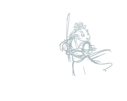
Rough Sketch
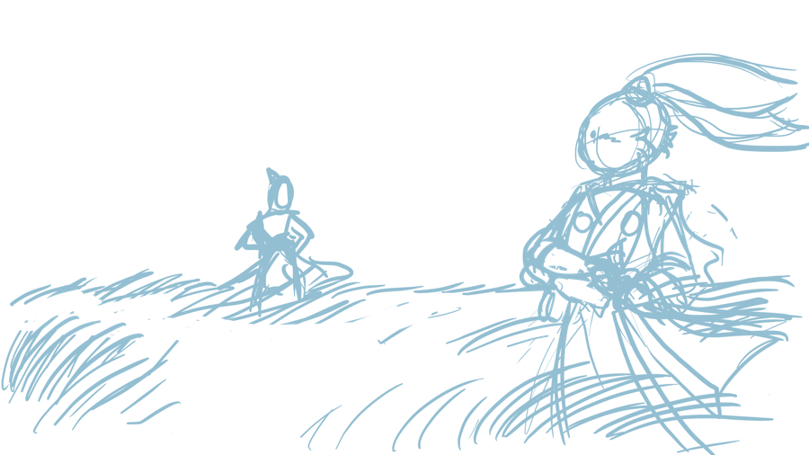
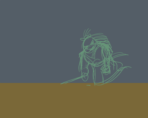
I usually start with a very rough sketch. I knew I wanted the Usagi drawing be a standoff between Usagi and another samurai with a composition reminiscent of classic samurai films. I hadn't decided what to do with the other samurai at this point, so he's just a loose doodle to give Usagi something to look at. As you'll see in some of the later drawings, he went through a lot of changes.
The blue color I sketch in is a throwback to the non-photo blue pencils that animators and other artists sometimes use. It also helps me remember which lines are the rough sketch when I start adding in new layers.
Background Colors
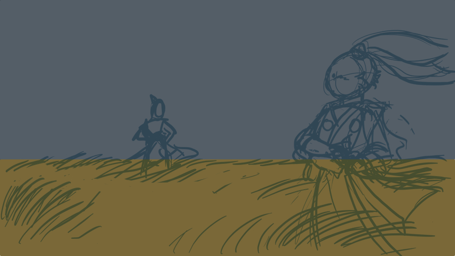
I didn't plan on showing my whole process when I drew this. So this is a recreation of the background colors I dropped in before I put in the details. I wanted to have a rough idea of the background colors so that I could make sure the colors on the characters with them once I started adding those. Plus it's super easy to hide any layer that's getting in the way if I need to see the sketch more clearly or something.
If you find this interesting and want to see more in the future, dear readers, I'll take some in-process screenshots of whatever I work on next.
Linework
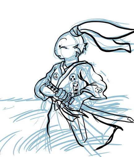
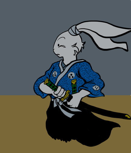
Usagi was already fairly tight in the sketch, so I went straight ahead to final linework without any intermediate sketches. I did still make some changes between the sketch and the final drawing, but it's mostly the same. I didn't bother fixing the mistake near the bottom right edge because the area ended up colored in black. I took some liberties with Usagi's profile, but I think what I ended up with looks good and he's still recognizable as Usagi. Drawing such a well designed character was an absolute joy.
I did end up doing a second sketch of one of the swords (which I forgot about until I made the layer visible again) because I needed to change the position from the original sketch to make with work with the pose. I also completely fudged the hand on the rough sketch, so they didn't really work until I got the position of the sword right.
Colors
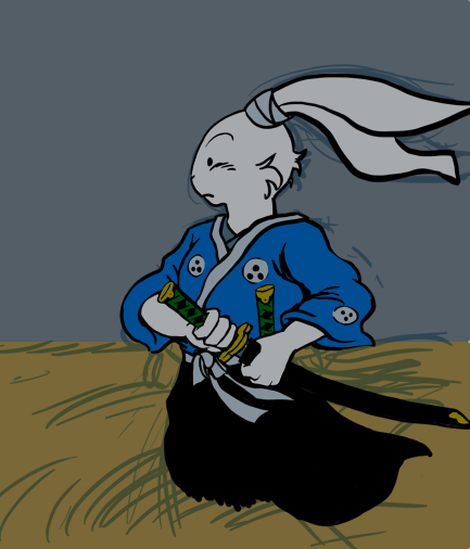
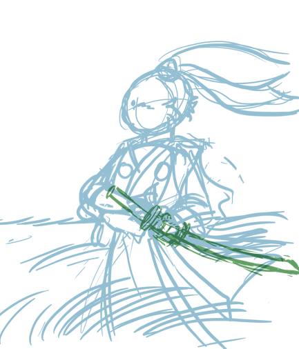
I actually like to start dropping in the colors before I finalize the linework. It usually means I have to go back and move the colors around if I make major changes to the linework, but it also helps me see mistakes in the drawing and gives me a better idea of how the whole thing is coming along. The colors are on a layer under the linework so I can color away and not worry about accidentally covering up a line.
This is also where the background color become important. I'd normally make Usagi's colors brighter, but since this scene has an overcast sky/ham-handed metaphor for impending conflict, everything's going to be darker.
Dot Hell
Usagi's shirt is covered in little dots, probably to add texture and visual interest. This particular detail was the least enjoyable part of drawing Usagi. I made the wise decision to put the dots on a separate layer so I didn't have to worry about messing up the linework. Plus, it let me lower the opacity, since the dots struck me as too distracting at full strength. However, I also made the stupid decision to draw just a few dots and use the clone stamp tool to replicate them over and over. In theory this should have saved me time and work, but in practice, it just meant that I had to go back in and fix a bunch of partial dots by hand.
Shadows and Highlights
Yet another layer for the highlights and shadows, over the colors, but under the linework and the dots. Nothing fancy here, just enough to add some dimension and drama.
I think I dropped the gold detail at the base of the sheath on the other sword because it ended up being covered up by grass, which you'll see later.
So now Uasgi's done, but someone's still missing...
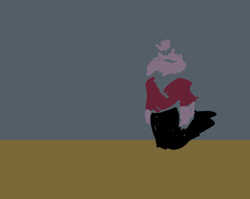
Samurai Porcupine
I was thinking about having Usagi's opponent be an existing character, but I decided to design my own instead. I went with a porcupine because I don't believe Stan Sakai has ever drawn a porcupine character (though I could be wrong), I liked the design possibilities for a porcupine - particularly putting his quills up in a topknot, and "samurai porcupine" has a nice ring to it.
To my surprise, his design turned out to be really tough to nail down. Above is my initial sketch. My first though was that he would be really big, but I felt like the pose looked stiff and uninteresting. The shape of his head was giving me a lot of trouble.
I probably went through a dozen or so sketches that I didn't like and deleted most of them. This guy probably had linework at some point before I decided that it wasn't working. This is further proof that I like to color before the linework is finished. He's getting a bit smaller and more upright here. I think I was still having trouble with the position of the sword.
The final sketch, sans background because the linework is very light for some reason. I still kind of miss the idea of a huge, hulking porcupine with quills all the way down his back. But at this point, I was getting frustrated and this pose worked.
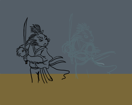
The final linework, probably moved over after I drew over the sketch for better composition. Very close to the sketch expect for the addition of his sheath and second sword. I am pleased with how his head turned out and the pose, if not the most dynamic, is at least believable.
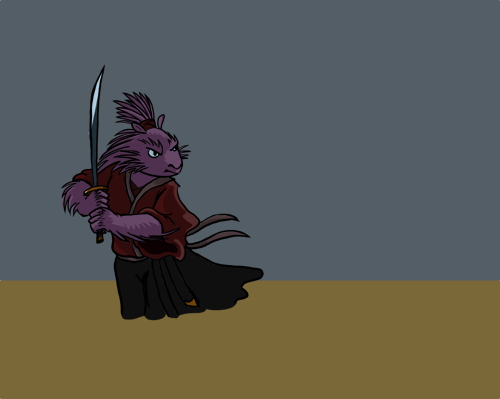
The colors, highlights, and shadows are all on the same level here, either because I just did it that way or because I merged the layers after the fact for some reason. The colors are pretty much the same as those in the abandoned sketch above. I wanted colors that would contrast with Usagi, so I went with warmer colors: a pinkish-purple for his body and a maroon shirt. The highlight on the blade was useful for making it visible against the sky.
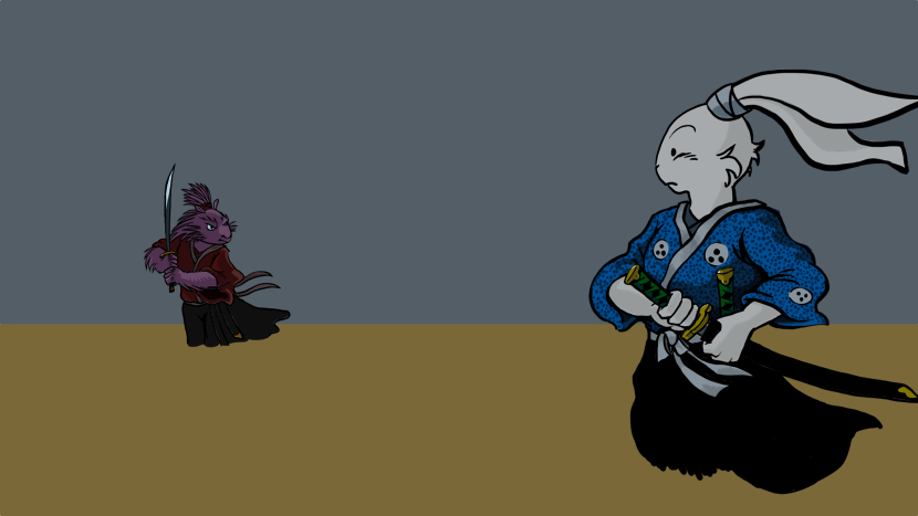
The two of them together on the dummy background.
Finish
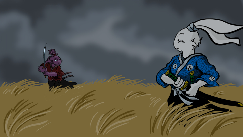
And the finished background, with a few layers of grass in front of the characters. The sky was done with a softer brush tool, a few different grays, and possibly a blur filter. I'll take better notes if I do this again.
I had considered doing a second version with a tokagé between Usagi and the porcupine poking its head up out of the grass and freaking out, but I never got around to it.
So that's how I draw, minus a few additional abandoned sketches, erased mistakes, breaks to play with dogs, and curses directed at dots.